Programs used: Photoshop, Illustrator, InDesign, and Figma.
This project is the concept for a mobile app called "TumTum", designed to help users discover, and review local restaurants. The primary objective of this app is to establish a connection between food enthusiasts, and nearby restaurants; then encouraging them to contribute a review on the app.
No design systems were used in the app's development, as my personal objective was to explore the creation of individual app elements.
The first step was to compile inspiration from the web into a mood board. I then looked into what colours and fonts were best suited for food content.
The initial step was to gather inspiration from online, and compiling everything in a mood board. I then researched the most suitable colours and fonts for food-centric content.
Drawing inspiration from existing applications, I created an outline of all the pages the app would contain. This helped inform the design of icons and visual elements.
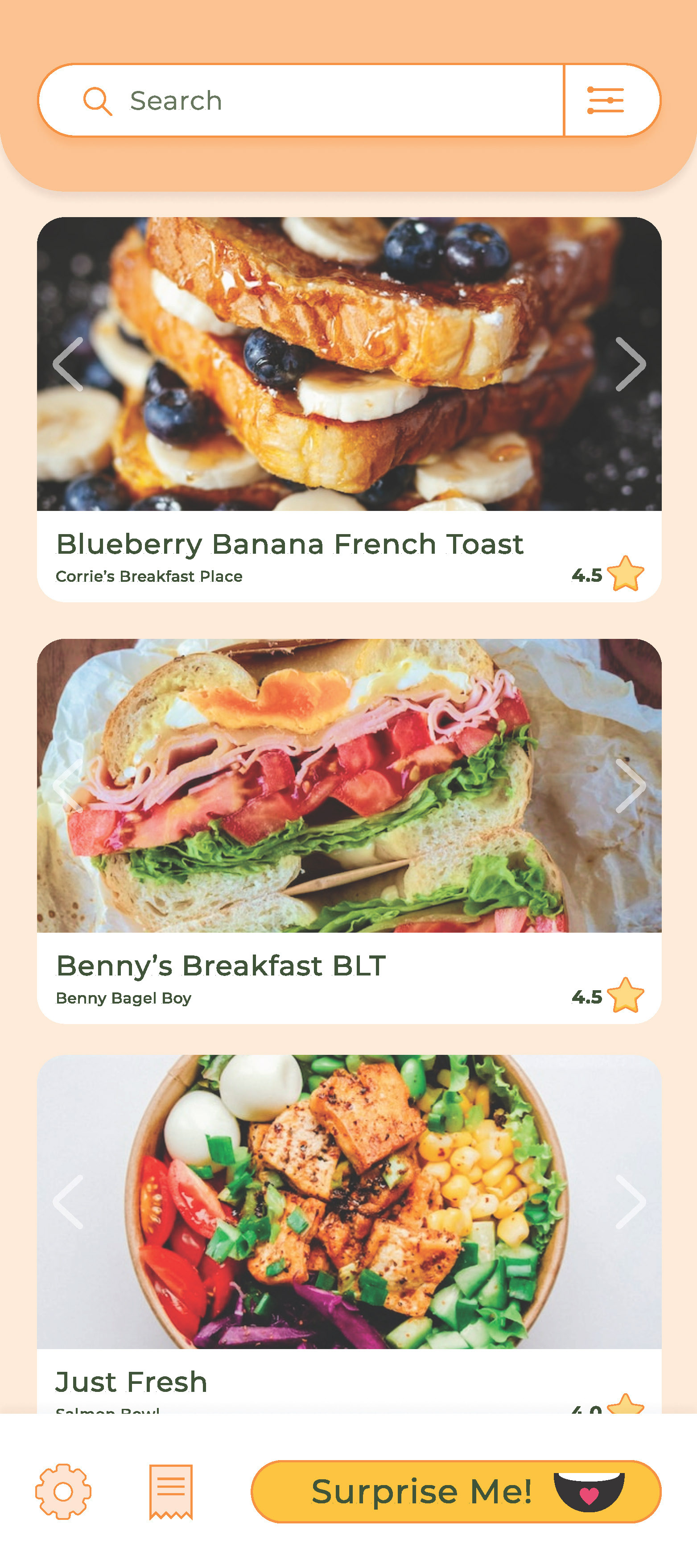
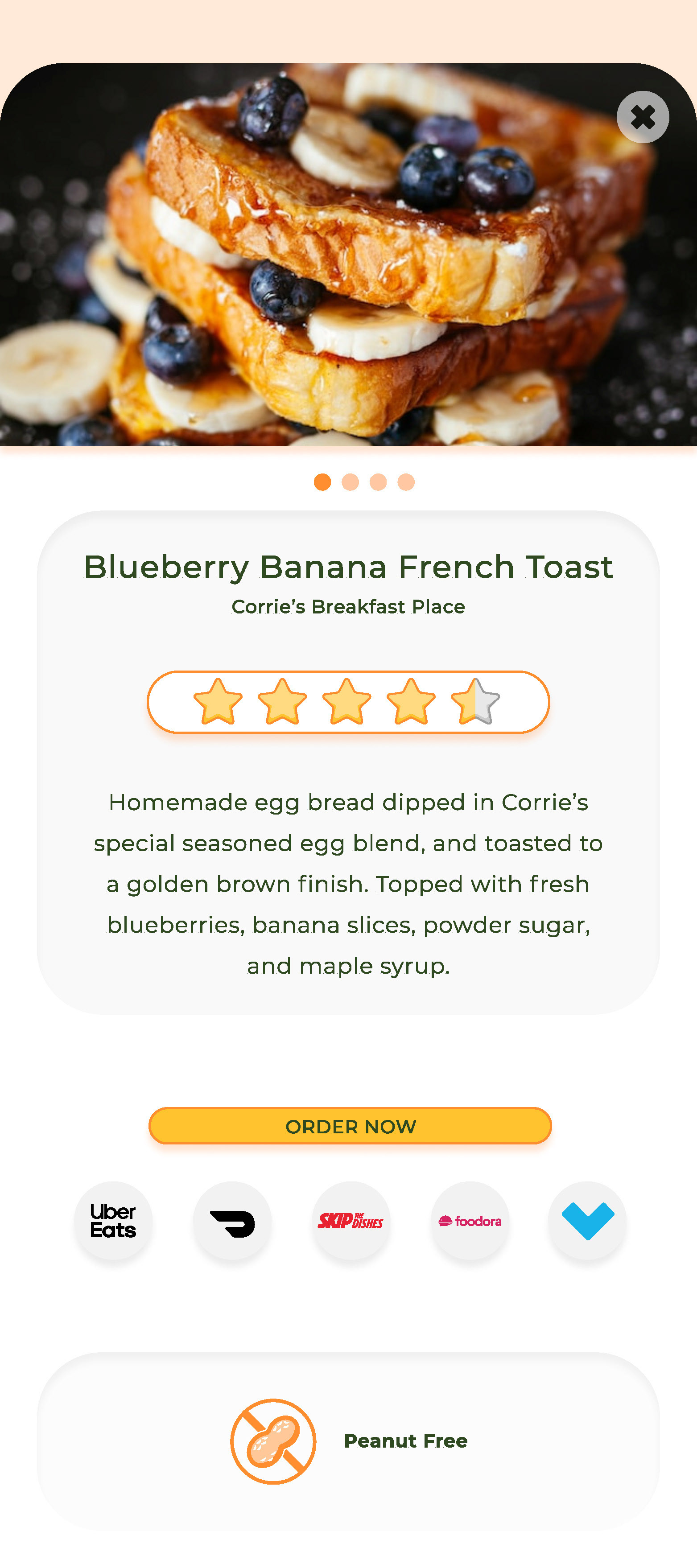
Bringing together all my ideas, I created wireframes for the home screen, and an individual food item screen.
Compiling these preliminary stages, I crafted high fidelity wireframes to demonstrate the layout for both the home screen, and individual food item screens.
Some key insights I gained from this project include: a deeper understanding of the emotional impact of colour; ergonomic considerations regarding screen accessibility; and the appropriate sizing, and spacing of elements based on their function, and significance.

